
PROJECT 1
Photoshop is an application I’ve slowly enjoyed getting to know over the years. Though, the potential to learn new things and techniques in photoshop never ends. During this project, I learned to challenge myself in photoshop and really use the elements it offers. Considering our limitations on color and shape, I was challenged to utilize tools like stroke, drop shadow, and other tools I’m still learning.
My beginning process of manipulating the negatives of my letters was not an efficient enough process for the work I need to create. I found myself trapped into making very similar images over and over. Upon noticing this I was able to reflect on my beginning stages and find ways to make each piece a little more different. This is where the use of other elements of photoshop came in, outside of the moving tool.
Some pieces became more modern and others became more retro just based on my usage of tone. Our challenge of using only tones of white to black is what led me to notice this. Instead of focusing on the colors of an image like I normally would, I had to search deeper. I noticed that the areas of shadow or lighter areas bring theme and feeling to the image. They have the ability to connect the viewer to things like a place or even a story. With multiple of my pieces, I got connections to a retro movie theatre, laser tagging, a mysterious movie and so many more. With perception, the viewer can connect the images to whatever they associate it with. My idea of retro movie theatre came from the top center unequivocal “B” because of the gradient, stroked center and large black ray crossing it. My conception of laser tagging came from the bottom right equivocal “B” because of my use of outer glow, which made all the crossing lines look like they were glowing like rays. The power of lights and shadow truly do make a difference.
In addition to noticing my tendency to make and manipulate my images in similar ways, I also realized that a lot of my images were very straight and crisp. Even with my utilization of the letter “B,” which has two curves in it, I still found a lot of my work to play off the straight lines more. To compete with my tendency to use the straight lines I tried making a couple of my images with a little more movement. I also challenged myself to make an actual image out of the negative shapes. Out of the negative shapes of the “B” I was able to create what I’d consider a deconstructed hamburger. I created this image specifically with principles of contrast, gravity, and specifically texture, which all collectively create the illusion or concept of a hamburger.
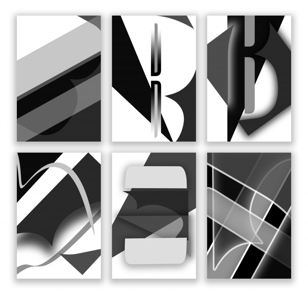
The second letter I chose was the letter “K.” I was challenged slightly more with this letter due to its lack of different negative shapes it created. Unlike the “B,” the “K” was made of only straight lines. With this letter, I focused more on design rather than the tools of photoshop. I spent a substantial amount of time simply turning and flipping the negative shapes around just to make something interesting. I find that these images have fewer story associations with them and more abstract elements. Although, they still demonstrate contrast, line, balance, and other design principles that I believe all of my images cohesively demonstrate.